its too hot to blog
almost. I've been spending as little time as possible at home since I have no AC. what time I do spend here is usually in the dark (lamps add too much heat), splayed across the couch, quietly moaning and sweating. and totally not in a sexy way. more in a kvetchy way. and I now depend on the kindness of friends who have let me couch surf the last few nights just to sleep in AC. tomorrow my window unit should be installed and I'm fairly certain my little 6,000 BTU unit will be the proverbial straw on the grid's back and we'll all go black. and john can blame the malthusian catastrophe we face on me. he's certain we're heading there. anyway, this weekend was not without a little bit of architecture. I blogged on curbed LA last week about the skirt exhibition at the prada store. jess and I decided to check it out on sat and while I mocked the LA Times' search for deeper meaning, I have to say, those were some gorgeous skirts. and we have to hand it to OMA, those architects know a thing or two about mounting an exhibition. they twirl, they swirl, they sway in the (non-existant) breeze. there is an emphasis on the quality and workmanship - some of the skirts have multiple magnifying glasses strategically positioned to highlight the beading, or materials, or design. Its a perfect embodiment of what Hal Foster argues in "Design and Crime" - architecture and design have subsumed art and criticism as the privileged discipline's of contemporary visual culture. And as the prada exhibition proves, its a domain that is no longer exclusive to the rich (although only the very rich can actually afford these skirts, the store - and exhibit - is open to all). more inportant that financial capital is cultural capital to "appreciate" these spaces. I'm going to go all grad school on your ass, and use a quote I depended on in my thesis from foster:
Might this ‘designed subject’ be the unintended offspring of the ‘constructed subject’ so vaunted in postmodern culture? One thing seems clear: just when you thought the consumerist loop could get no tighter in its narcissistic logic, it did: design abets a near-perfect circuit of production and consumption, without much ‘running-room’ for anything else.for what its worth, foster is one of the only theorists I still remember and defer to from grad school and his book is totally readable even to the layperson.
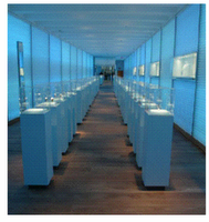
 but we didn't just stop at the prada store. we also stopped into the georg jensen store down the block to check out tadao ando's design. And look, ma! No concrete! yes, its icy cool, minimalist and very very blue, but tadao seems to have given up his signature material on rodeo drive. surprisingly, the store only seems to feature their very expensive jewelry in the individual cases and there is none of their housewares to be found. according to the press release, the glass cubes can rise and descend so salespeople can show customers the jewelry from the cases. still, we were left feeling a little 'eh.' especially after just having been to the prada store. if these stores were celebrities prada would be angelina jolie - vibrant, sexy, every time you look you hope to discover something new. and georg jensen, well, I hate to go for the obvious jennifer aniston comparison so let's go with gwyneth paltrow - restrained, minimal, classy but maybe a little boring.
I'm just waiting for the retail equivalent of paris hilton to open up in LA. oh wait, its coming to melrose.


1 Comments:
um, kate hudson? I feel like she was pregnant for about 14 months and sort of embodies the boho vibe they have going on right now.
Post a Comment
<< Home